
Business
Business
→
→
Rentickle is a furniture and appliance rental platform that lets users rent products through monthly payments instead of making large upfront purchases.
Rentickle is a furniture and appliance rental platform that lets users rent products through monthly payments instead of making large upfront purchases.
Rentickle is a furniture and appliance rental platform that lets users rent products through monthly payments instead of making large upfront purchases.
Role
Role
→
→
Conducted competitive research, user audits & heatmap reviews.
Designed and simplified the checkout experience based on research insights.
Collaborated with PMs & developers, raised UX tickets, and worked within product constraints.
Conducted competitive research, user audits & heatmap reviews.
Designed and simplified the checkout experience based on research insights.
Collaborated with PMs & developers, raised UX tickets, and worked within product constraints.
Conducted competitive research, user audits & heatmap reviews.
Designed and simplified the checkout experience based on research insights.
Collaborated with PMs & developers, raised UX tickets, and worked within product constraints.
Challenge
Challenge
→
→
Checkout was complex and time-consuming, with multiple steps, fields, and decisions around rent, deposits, and KYC.
Unclear upfront costs and a high-friction KYC step caused users to drop off before completing the checkout.
Checkout was complex and time-consuming, with multiple steps, fields, and decisions around rent, deposits, and KYC.
Unclear upfront costs and a high-friction KYC step caused users to drop off before completing the checkout.
Checkout was complex and time-consuming, with multiple steps, fields, and decisions around rent, deposits, and KYC.
Unclear upfront costs and a high-friction KYC step caused users to drop off before completing the checkout.
Solution
Solution
→
→
Consolidated 5 checkout steps into 1, removing unnecessary fields and reducing visual and decision-making clutter.
Removed the unnecessary billing-address step, defaulted to shipping, and introduced a clear upfront pricing breakdown with refundable deposits and fees.
Consolidated 5 checkout steps into 1, removing unnecessary fields and reducing visual and decision-making clutter.
Removed the unnecessary billing-address step, defaulted to shipping, and introduced a clear upfront pricing breakdown with refundable deposits and fees.
Consolidated 5 checkout steps into 1, removing unnecessary fields and reducing visual and decision-making clutter.
Removed the unnecessary billing-address step, defaulted to shipping, and introduced a clear upfront pricing breakdown with refundable deposits and fees.
Impact
Impact
→
→
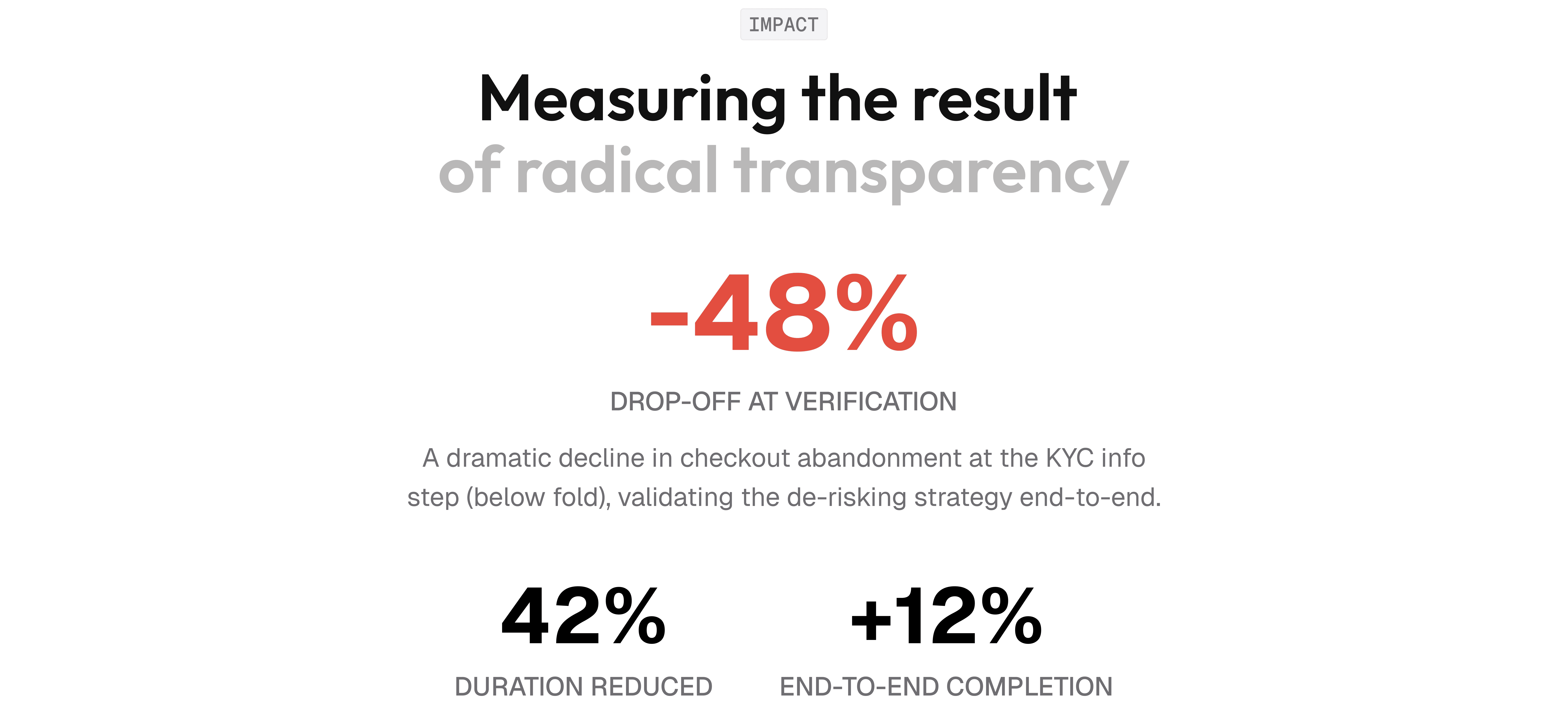
42%
42%
↓
↓
checkout time,
from 6m 22s → 3m 42s
Checkout time, from 6m 22s → 3m 42s
12%
12%
↓
↓
Increase in Completion Rate from the 9.8%.
Increase in Completion Rate from the 9.8%.
48%
48%
↑
↑
Drop-off at
identity verification
Drop-off at identity verification
42%
↓
Checkout time, from 6m 22s → 3m 42s
12%
↓
Increase in Completion Rate from the 9.8%.
48%
↑
Drop-off at identity verification
BASELINE FRICTIONS
BASELINE FRICTIONS
BASELINE FRICTIONS
The numbers that defined the problem
The numbers that defined the problem
The numbers that defined
the problem
Unlike traditional e-commerce, renting furniture and appliances is a high-commitment relationship. Users aren’t just buying a product; they are agreeing to recurring monthly rental payments, digesting refundable security deposits, and undergoing mandatory KYC verification checks.
This heavy cognitive load was paralysing mobile shoppers right at the finish line.
Unlike traditional e-commerce, renting furniture and appliances is a high-commitment relationship. Users aren’t just buying a product; they are agreeing to recurring monthly rental payments, digesting refundable security deposits, and undergoing mandatory KYC verification checks.
This heavy cognitive load was paralysing mobile shoppers right at the finish line.
Average checkout duration
Average checkout duration
Average checkout duration
6m 22s
6m 22s
6m 22s
Checkout completion rate
Checkout completion rate
Checkout completion rate
9.8%
9.8%
9.8%
The Mission
The Mission
The Mission
Simplify Checkout Flow
Simplify Checkout Flow
Simplify Checkout Flow
Our friction audit identified three critical vectors that forced users to think when they should have been feeling the excitement of a purchase.
Our friction audit identified three critical vectors that forced users to think when they should have been feeling the excitement of a purchase.
1. Pricing Anxiety: Hidden fees and confusing math made users hesitate
before the final tap.
1. Pricing Anxiety: Hidden fees and confusing math made users hesitate
before the final tap.
1. Pricing Anxiety: Hidden fees and confusing math made users hesitate before the final tap.
2. Form Fatigue: No default shipping address meant every purchase required
repetitive manual typing.
2. Form Fatigue: No default shipping address meant every purchase required
repetitive manual typing.
2. Form Fatigue: No default shipping address meant every purchase required repetitive manual typing.
3. Visual Noise: Broken layouts, redundant fields, and zero instant feedback on actions.
3. Visual Noise: Broken layouts, redundant fields, and zero instant feedback on actions.


Strategic Interventions
Strategic Interventions
Strategic Interventions
Turning Friction Into Flow
Turning Friction Into Flow
Turning Friction Into Flow
We mapped user flows and analyzed behavioral drop-offs to pinpoint exactly where friction occurred. By focusing on heavy form fields and redundant layouts, we redesigned the path into a fast, stress-free funnel.
We mapped user flows and analyzed behavioral drop-offs to pinpoint exactly where friction occurred. By focusing on heavy form fields and redundant layouts, we redesigned the path into a fast, stress-free funnel.

Interventions 01
Interventions 01
Interventions 01
Designing transparent subscription billing
Designing transparent subscription billing
We pulled the complete financial commitment forward. Instead of hiding the security deposit until the final step, we designed a unified pricing matrix showing the exact monthly rental alongside the refundable deposit and setup fees. Highlighting “refundable” built immediate transactional trust.
We pulled the complete financial commitment forward. Instead of hiding the security deposit until the final step, we designed a unified pricing matrix showing the exact monthly rental alongside the refundable deposit and setup fees. Highlighting “refundable” built immediate transactional trust.

Interventions 02
Interventions 02
Interventions 02
Putting the entire checkout on a single page
Putting the entire checkout
on a single page
Putting the entire checkout
on a single page
Instead of forcing users to jump back and forth between separate steps for shipping, billing, and order summaries, we consolidated the entire journey into a single reactive interface. By visually simplifying the layout, removing nested pages, and clean-cutting visual noise, we brought absolute clarity and immediate focus to the primary “Proceed to Pay” action.
Instead of forcing users to jump back and forth between separate steps for shipping, billing, and order summaries, we consolidated the entire journey into a single reactive interface. By visually simplifying the layout, removing nested pages, and clean-cutting visual noise, we brought absolute clarity and immediate focus to the primary “Proceed to Pay” action.
OLD FLOW:
OLD FLOW:
OLD FLOW:
Cart → Login → Checkout → Address → Agree T&C → Proceed to Pay
Cart → Login → Checkout → Address → Agree T&C → Proceed to Pay
Cart → Login → Checkout → Address → Agree T&C → Proceed to Pay
NEW FLOW:
NEW FLOW:
NEW FLOW:
Checkout → Address → Proceed to Payment
Checkout → Address → Proceed to Payment
Checkout → Address → Proceed to Payment

Interventions 03
Interventions 03
Interventions 03
Removing the billing address step using data
Removing the billing address step using data
Removing the billing address step using data
We analyzed our data and found that only ~2% of our B2C users used a separate billing address from their shipping address. Based on this, we nested the billing address options directly inside the address selection drawer, completely eradicating a redundant step for 98% of our customers.
We analyzed our data and found that only ~2% of our B2C users used a separate billing address from their shipping address. Based on this, we nested the billing address options directly inside the address selection drawer, completely eradicating a redundant step for 98% of our customers.

Reflection
Reflection
Reflection
Working With Real Data: This was my first time working hands-on with heatmaps and scroll maps. It changed how I look at a screen, because the data shows you exactly where your assumptions were wrong.
Working With Real Data: This was my first time working hands-on with heatmaps and scroll maps. It changed how I look at a screen, because the data shows you exactly where your assumptions were wrong.
Working With Real Data: This was my first time working hands-on with heatmaps and scroll maps. It changed how I look at a screen, because the data shows you exactly where your assumptions were wrong.
Research That Removes: The most valuable research we did led to removing things; fields, steps, decisions. That felt counterintuitive at first. Now it feels like the whole point.
Research That Removes: The most valuable research we did led to removing things; fields, steps, decisions. That felt counterintuitive at first. Now it feels like the whole point.
Research That Removes: The most valuable research we did led to removing things; fields, steps, decisions. That felt counterintuitive at first. Now it feels like the whole point.
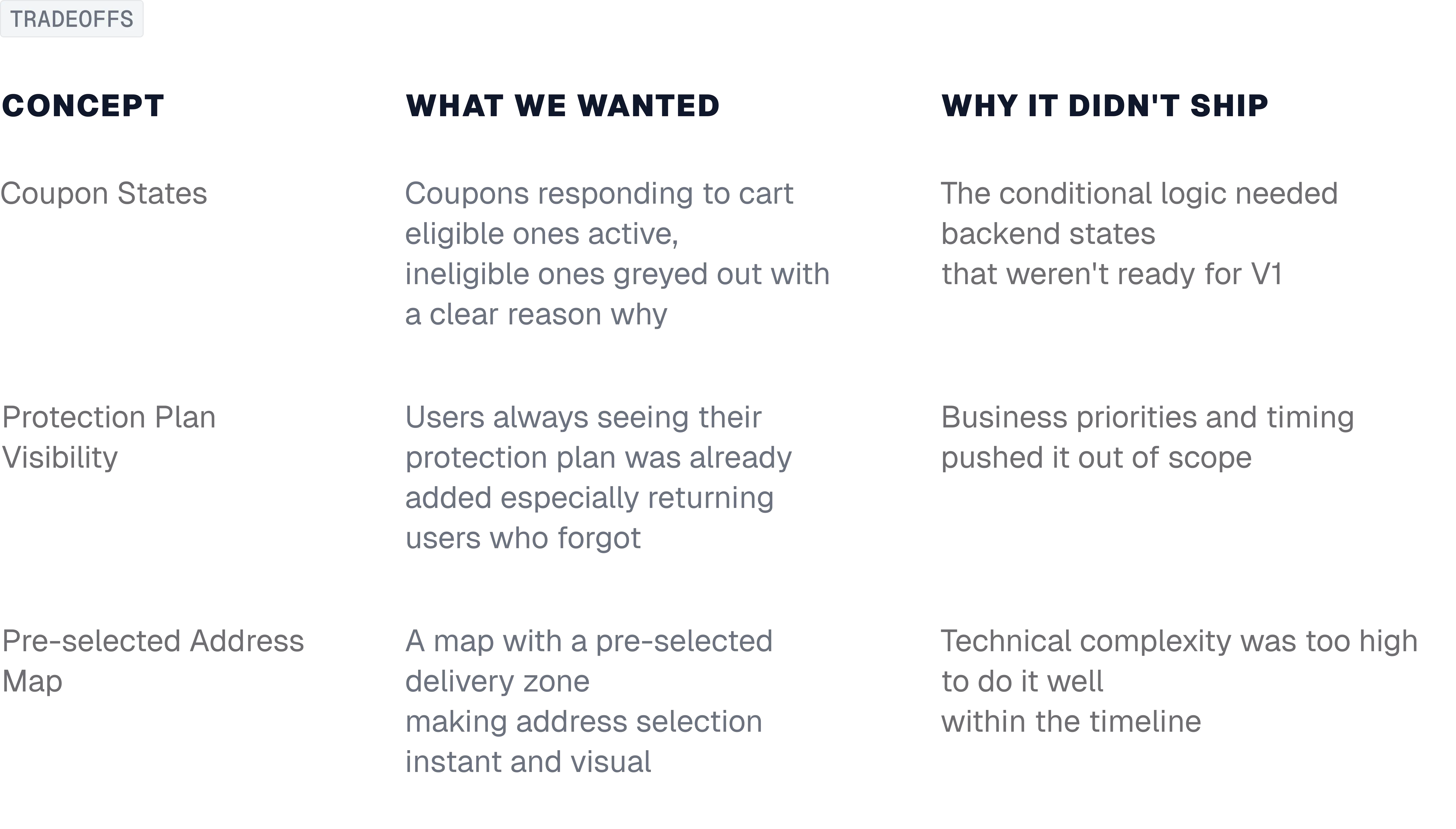
Understanding Limitations Early: The features that didn't ship; protection plan visibility, address map were the right ideas at the wrong time. Next time, I'd understand the technical and business constraints upfront and shape the solution around what's actually possible in that cycle, not after scoping closes.
Understanding Limitations Early: The features that didn't ship; protection plan visibility, address map were the right ideas at the wrong time. Next time, I'd understand the technical and business constraints upfront and shape the solution around what's actually possible in that cycle, not after scoping closes.
Understanding Limitations Early: The features that didn't ship; protection plan visibility, address map were the right ideas at the wrong time. Next time, I'd understand the technical and business constraints upfront and shape the solution around what's actually possible in that cycle, not after scoping closes.


